January 18, 2018
Why Communication Design Matters

We live in a world where design matters. We are constantly bombarded by images and messages – billboards, Instagram and Facebook notifications, banner ads, text messages and calendar reminders. It’s an era of constant distraction – a flood gate of visuals and information bytes – and because of that, your organization only has two to three seconds to gain someone’s attention.
A good statement design can cut through the clutter and move your communication to a patient’s front of mind.
Design literally “sets the tone” and is an essential attribute in capturing someone’s attention and willingness to respond. Color theory teaches us that specific colors are tied to emotions. If you effectively use color in your communications, you can influence a patient’s reaction and response after reviewing your statement. As a result of patient test-group feedback and interviews, RevSpring has found the following comments to be common responses when it comes to statement design:
- Black and white statements feel boring, corporate, and generic
- A pop of green to a previously black and white statement invokes a sense of calm and is professional
- Purple is associated with royalty, spirituality, and authenticity
- Orange has emotional ties to warmth, security, fun, and comfort
Is Your Call to Action Hidden and Passive?
The purpose of good design is to navigate a patient through chunks of information and motivate them to respond to an action. A crucial element of good design is creating a call to action that the patient clearly sees and understands. A well-designed statement will guide someone to that desired action while bad design with unnecessary clutter will dilute and distract your patient away from the call to action.
The most valuable tip we offer to our clients is to create ONE call to action, and only one, and make sure it’s clear, precise, and direct. Do you want the patient to pay in full? Pay online? Return a charity form?
Another suggestion we often share with clients is to apply a heavy dose of white space, which is the simplest way to be clear and direct. White space gives the reader’s eyes “room to breathe” with a focus on your text or simple graphics on a single call to action.
Test, Test, and Test Again
 If you have a beautifully designed communication, with plenty of white space, meaningful and intentional use of color, and a specific and single call to action, you might feel pretty good about what you’ve done (and you should!) but your work is not yet done. Now, you have to make sure it works.
By testing your statement using gaze path and heat map testing, you can make sure the reader’s eyes are landing and guiding them to the right places, which will inform and motivate them to action. If the call to action or balance due is hard to find, it’s time for a tweak or redesign.
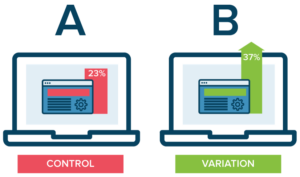
A/B testing is also a critical part of the process and lets you know what works and what doesn’t before anything goes to production. In A/B testing, control groups use statistically valid experiments with large enough sample sizes to confidently identify the “winner.”
To discuss ways a redesigned statement can help boost your financial outcome, email learnmore@revspringinc.com and one of our Patient Engagement Consultants can put you on the path to collecting more.


